Both Python and R have a plotting library based on The Grammar of Graphics by Leland Wilkinson. The Python package (plotnine) is actually directly based on the R package (ggplot2) so their internal syntax is very similar. In fact the only serious differences between the two languages’ ggplot operations are those that derive from larger syntax and format differences.
Note that in the following examples we will not namespace Rggplot2 functions (e.g., ggplot2::aes) for convenience. Any function not namespaced in the R examples producing graphs can be assumed to be exported from ggplot2.
Library & Data Loading
Begin by loading any needed libraries and reading in an external data file for use in downstream examples.
Load the ggplot2 and dplyr libraries as well as our vertebrate data.
# Load needed librarylibrary(ggplot2)library(dplyr)# Load datavert_r <- utils::read.csv(file =file.path("data", "verts.csv"))# Keep only rows where species and year are *not* NAcomplete_r <- dplyr::filter(.data = vert_r,!is.na(species) &nchar(species) !=0&!is.na(year) &nchar(year) !=0)# Group data by species and yeargrp_r <- dplyr::group_by(.data = complete_r, year, species)# Average weight by species and yearavg_r <- dplyr::summarize(.data = grp_r, mean_wt =mean(weight_g, na.rm = T))# Check out first few rowshead(avg_r, n =5)
Remember that we use an ! in R to negate a conditional masking function like is.na.
Note that the summarize function drops all columns that either it doesn’t create or that are not used as grouping variables.
Load the plotnine, os, and pandas libraries as well as our vertebrate data.
# Load needed libraryimport osimport plotnine as p9import pandas as pd# Load datavert_py = pd.read_csv(os.path.join("data", "verts.csv"))# Keep only rows where species and year are *not* NAcomplete_py = vert_py[(~pd.isnull(vert_py["species"])) & (~pd.isnull(vert_py["year"]))]# Group data by species and yeargrp_py = complete_py.groupby(["year", "species"])# Average weight by species and yearavg_py = grp_py["weight_g"].mean().reset_index(name ="mean_wt")# Check out first few rowsavg_py.head()
Remember that we use a ~ in Python to negate a conditional masking function like isnull.
Core Components
There are three fundamental components to ggplots:
Datavariable(s)/object(s) used in the graph
Aesthetics (i.e., which column labels/names are assigned to graph components)
Geometries (i.e., defining the type of plot)
Data & Aesthetics
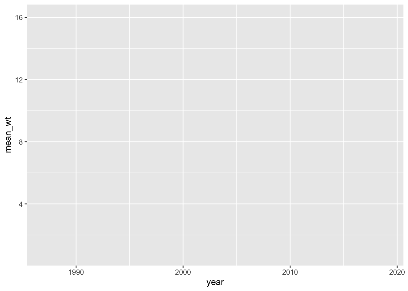
We can create an empty graph with correctly labeled axes but without any data by defining the data and aesthetics but neglecting to include any geometry. Make a graph where year is on the X-axis (horizontal) and mean weight is on the Y-axis (vertical).
Note that we need to wrap our Python ggplot in parentheses to avoid errors.
As we alluded to above, the ggplot function with data and mapped aesthetics is enough to create the correct axis labels and tick marks but doesn’t actually put our data on the graphing area. For that, we’ll need to add a geometry.
Geometries
All geometry functions–in either language–take the form of geom_* where * is name of the desired chart type (e.g., geom_line adds a line, geom_bar adds bars, etc.). In order to add geometries onto our plot–again, in either language–we use the + operator. Note that style guides suggest ending each line of a ggplot with a + and including each new component as their own line below. This keeps even very complicated graphs relatively human-readable.
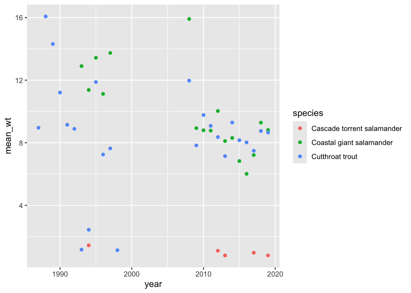
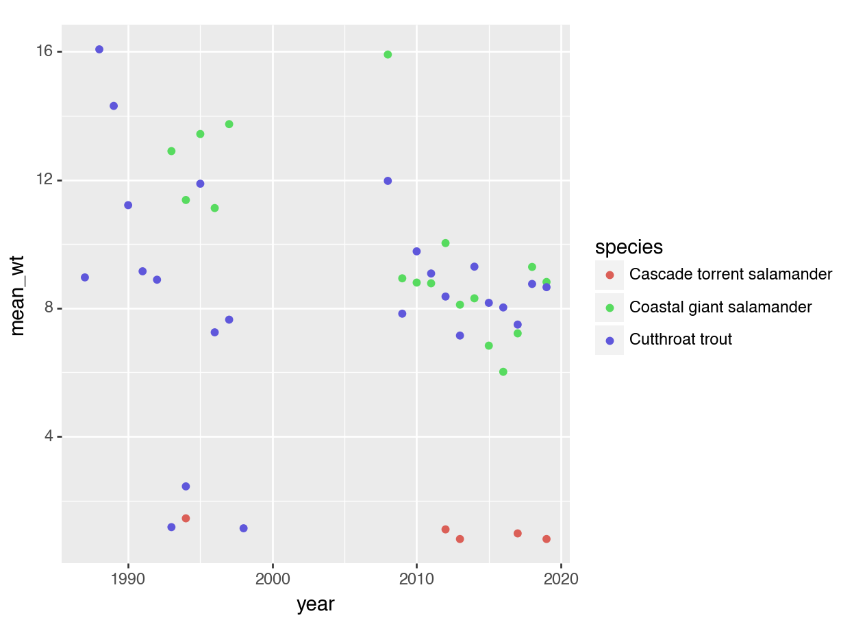
Let’s make these graphs into scatter plots by adding a point geometry.
Note that in either language the geom_point function does not need either data or aesthetics because it “inherits” them from the ggplot function! You can specify aesthetics (or data!) for a particular geometry but it is simpler to specify it once if you’re okay with all subsequent plot components using the same data/aesthetics.
Let’s practice a little further by making the color of the points dependent upon species.
Note that we could specify the color aesthetic in the ggplot aesthetics!
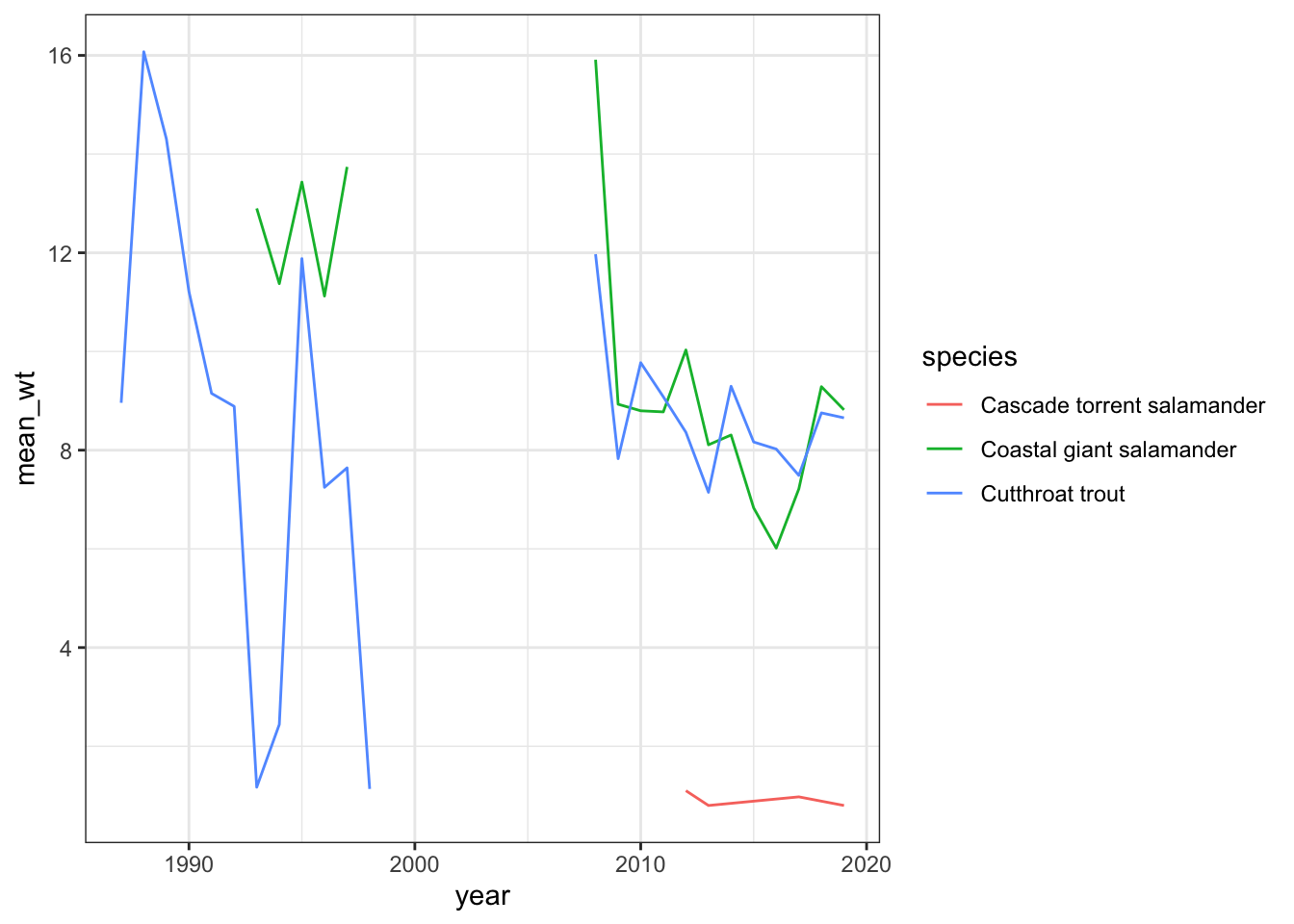
Iterative Revision
One of the real strengths of ggplots is that you can preserve part of your ideal graph as a variable/object and then add to it later. This saves you from needing to re-type a consistent ggplot function when all you really want to do is experiment with different geometries
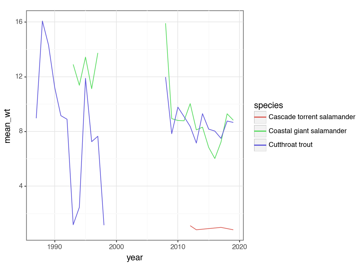
Create the top level of the graph and assign it to an object. Then–separately–add a line geometry.
# Create graphgg_r <-ggplot(data = avg_r, mapping =aes(x = year, y = mean_wt, color = species)) # Add the line geometrygg_r +geom_line()
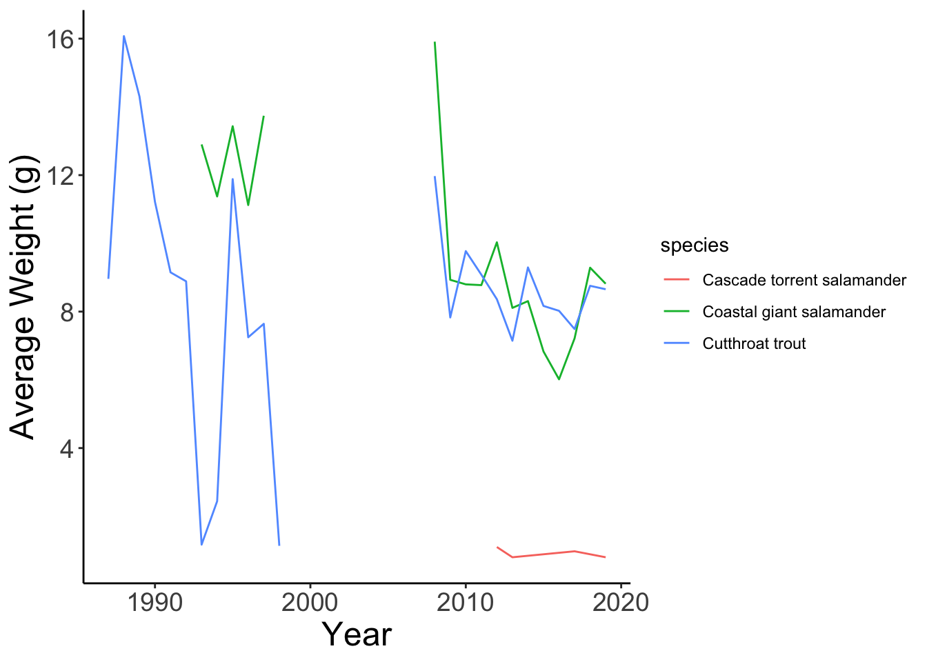
Create the top level of the graph and assign it to a variable. Then–separately–add a line geometry.
# Create graphgg_py = p9.ggplot(data = avg_py, mapping = p9.aes(x ="year", y ="mean_wt", color ="species"))# Add the line geometry(gg_py + p9.geom_line())
<Figure Size: (640 x 480)>
Customizing Themes
Once you have a graph that has the desired content mapped to various aesthetics and uses the geometry that you want, it’s time to dive into the optional fourth component of grammar of graphics plots: themes! All plot format components from the size of the font in the axes to the gridline width are controlled by theme elements.
To emphasize the theme modification examples below, let’s assign all components of the above graph into a new variable/object.
# Make the line graph objectline_r <- gg_r +geom_line()
# Make the line graph variableline_py = gg_py + p9.geom_line()
Built-In Themes
To begin, plotnine/ggplot2 both come with pre-built themes that change a swath of theme elements all at once. If one of these fits your visualization needs then you don’t need to worry about customizing the nitty gritty yourself which can be a real time-saver.
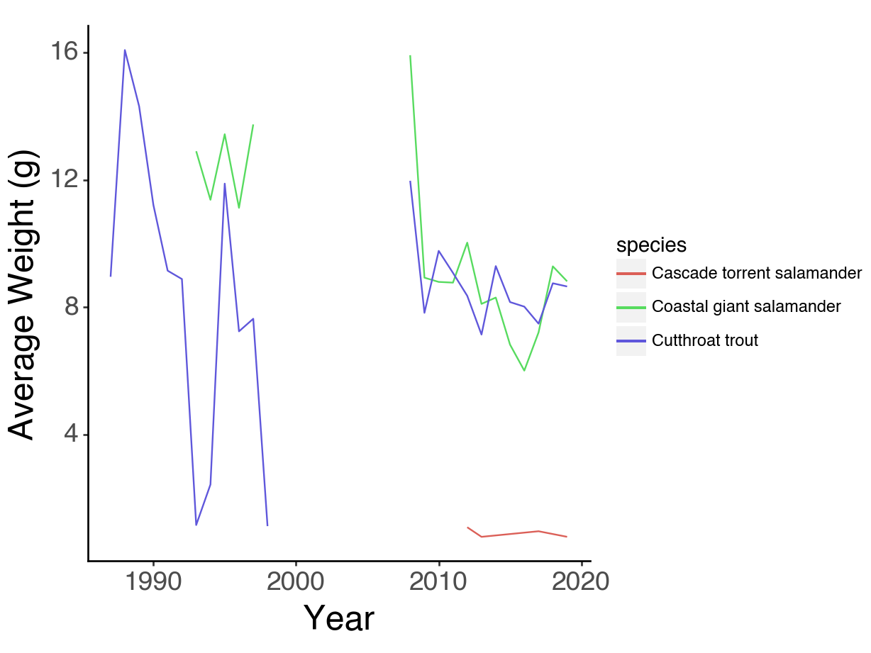
Let’s add the built-in ‘black and white’ theme to our existing graph using the theme_bw function.
# Add the black and white theme(line_py + p9.theme_bw())
<Figure Size: (640 x 480)>
Fully Custom Themes
If we’d rather, we can use the theme function and manually specify particular elements to change ourselves! Each element requires a helper function that matches the category of element being edited. For instance, text elements get changed with element_text() while line elements with element_line. When we want to remove an element we can use element_blank. Let’s increase the font size for our axis tick labels and titles.
We’ll also use the labs function to customize our axis titles slightly.
This lesson was designed to showcase the similarity between Python and R, not to provide an exhaustive primer on all things ggplot. There are a lot of really cool graphs you can make with these tools and hopefully this website makes you feel better prepared to translate the knowledge you have from one language into the other!
If you are new to ggplot, I recommend searching out “faceting” graphs in particular as this can be a particularly powerful tool when you have many groups within your data variable/object.