Data Visualization Basics
A Guide to Your Process
Scheduling
Learning Objectives
Practice
Class Discussion
Today’s Plan
- Types of Data
- Aside: Tidy Data
- Anatomy of a Graph
- Visualization Goals
- Graph Types
Today’s Learning Objectives
After today’s session you will be able to:
- Define two major types of data
- Identify characteristics of “tidy” data
- Define fundamental anatomy of a graph
- Explain how visualization is affected by what message you want to convey
- Paraphrase how you can choose what type of graph to use
Graphing Overview
- Before you can get into graphing, you need to know:
- What type(s) of data you have
- What message you want to share with your audience
Types of Data
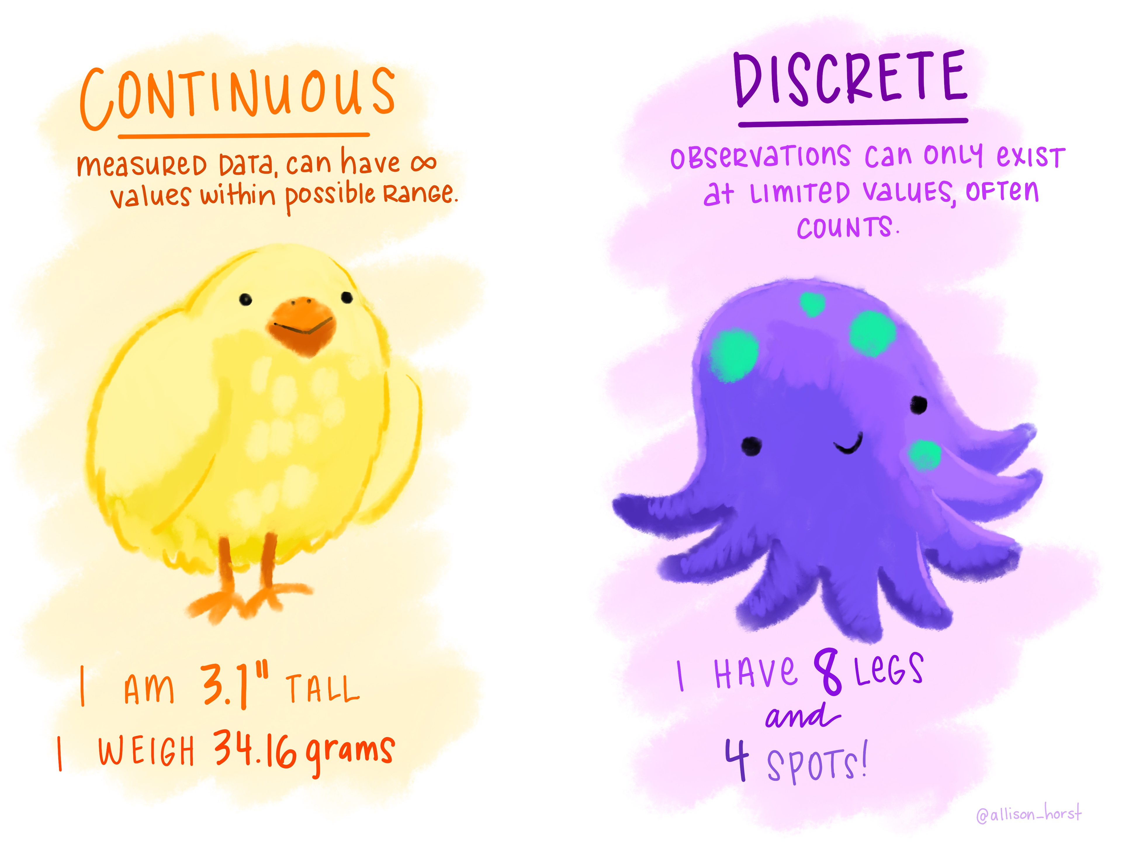
Continuous
- Infinite options within possible range
- For example: height, length, profit
Categorical
Types of Data
Continuous
- Infinite options within possible range
- For example: height, length, profit
Categorical
- Options limited to particular intervals
- For example: counts, satisfaction ratings
Types of Data - Comic
![Comic with a bird on the left under the 'continuous' heading and some non-integer number examples and an octopus on the right under the 'discrete' heading and some integer examples]()
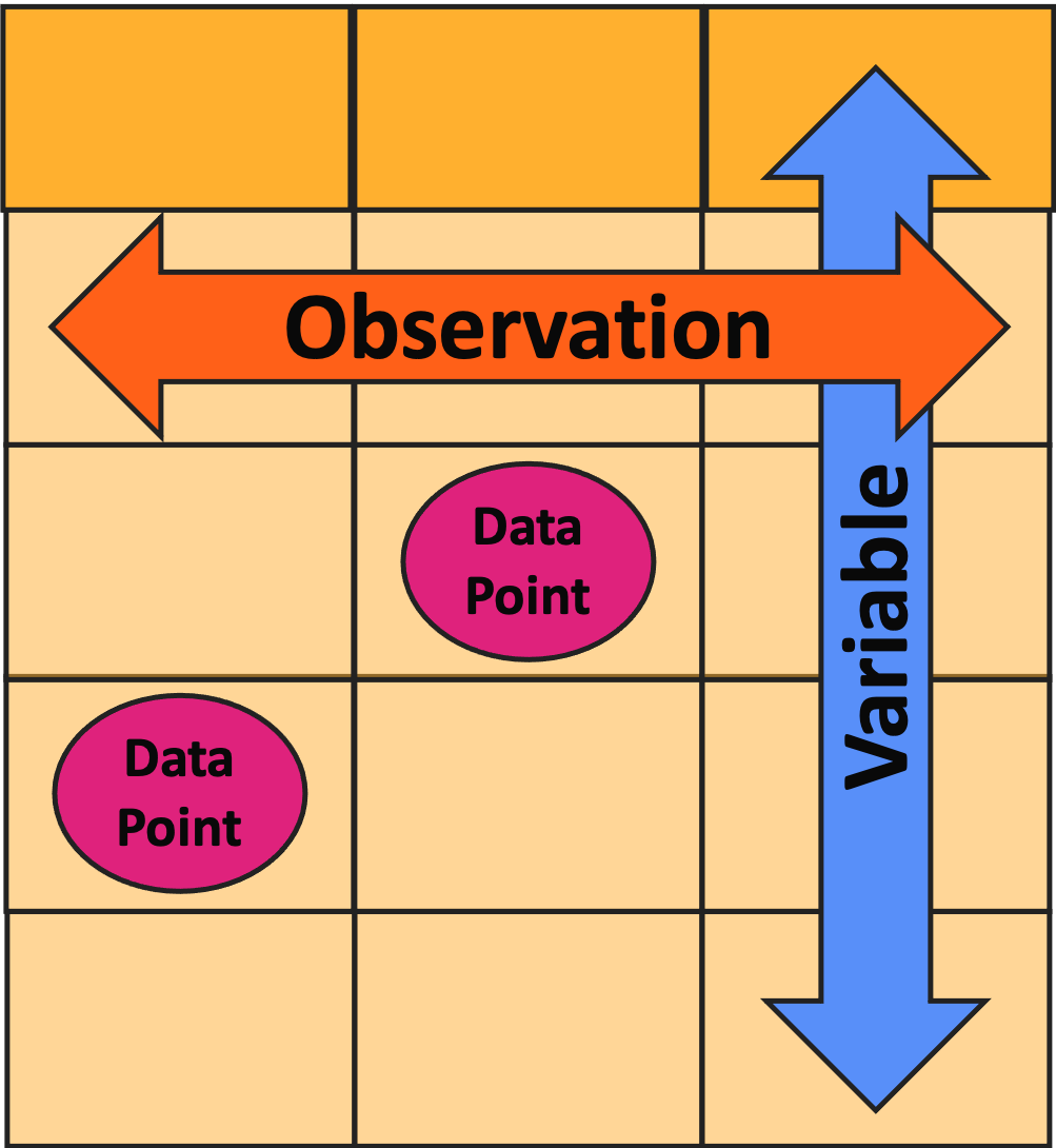
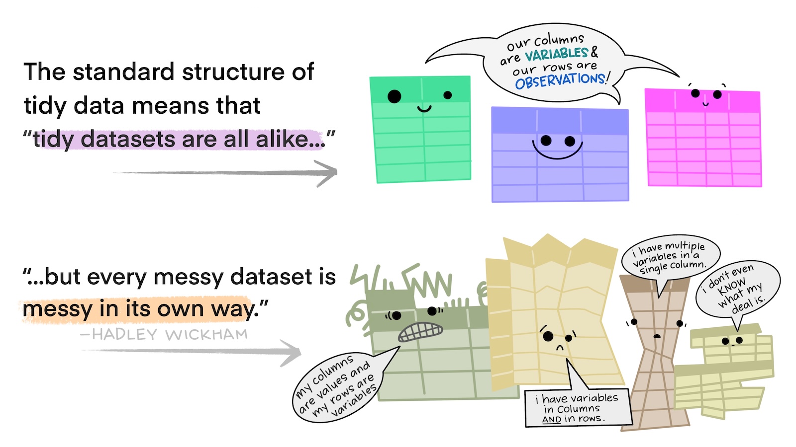
What is ‘Tidy Data’?
- One row = one observation
- One column = one variable
- One cell = one data point
Tidy vs. Un-Tidy Comic
![Cartoon of several brightly-colored, anthropomorphic tables with a speech bubble saying 'we are all tidy' above several other tables in dull colors and various, irregular shapes with a speech bubble saying 'we are untidy in different ways']()
Un-Tidy Example 1
![Screen capture of an untidy data table in MS Excel where several sub-tables are included in different places on the same sheet]()
- Is every column a variable?
- Is every row an observation?
Un-Tidy Example 1
![Screen capture of an untidy data table in MS Excel where several sub-tables are included in different places on the same sheet]()
- Is every column a variable? No!
- Is every row an observation? No!
Un-Tidy Example 2
![Untidy data table where each column is a variable but each row is not an observation because several variables are present in the same row]()
- Is every column a variable?
- Is every row an observation?
Un-Tidy Example 2
![Untidy data table where each column is a variable but each row is not an observation because several variables are present in the same row]()
- Is every column a variable? Yep
- Is every row an observation? No!
Fixing Un-Tidy Data
- What if you realize your data are not tidy?
- Ideally, you’d use some sort of code language (e.g., R, Python) to fix the data
- If you don’t speak code, carefully copy/pasting things is okay
- I strongly recommend making a copy of the file that you don’t touch before doing this!
- That way you can check your work if you make a mistake
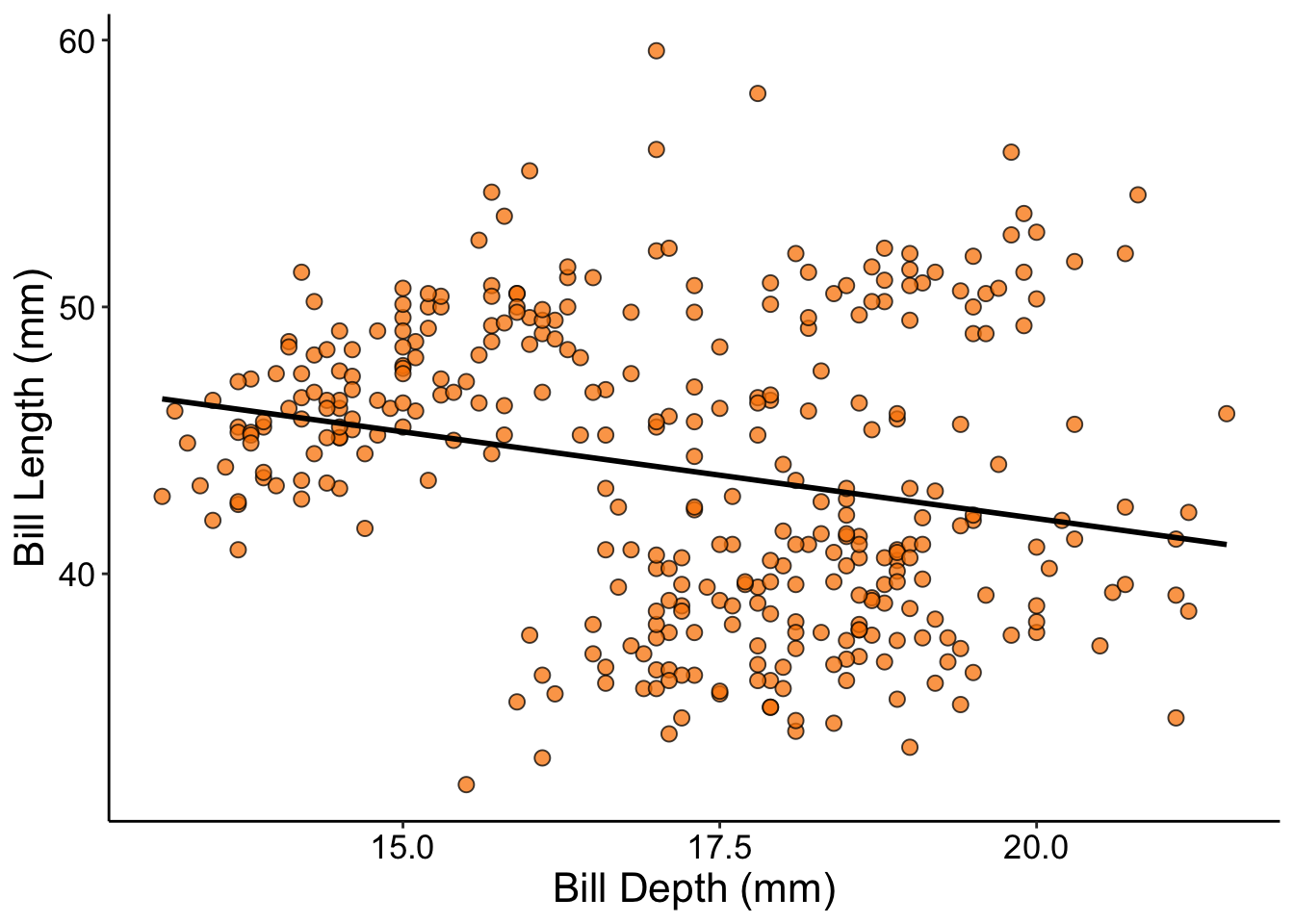
Anatomy of a Graph - P1
![Scatterplot showing a negative relationship between the Y and X axes]()
Anatomy of a Graph - P2
![Same scatterplot as in prior image but with a box around the vertical axis (labeled 'y axis/response variable'), another around the horizontal axes (labeled 'x axis/explanatory variable'), and one final one around the plot area (labeled 'plot area')]()
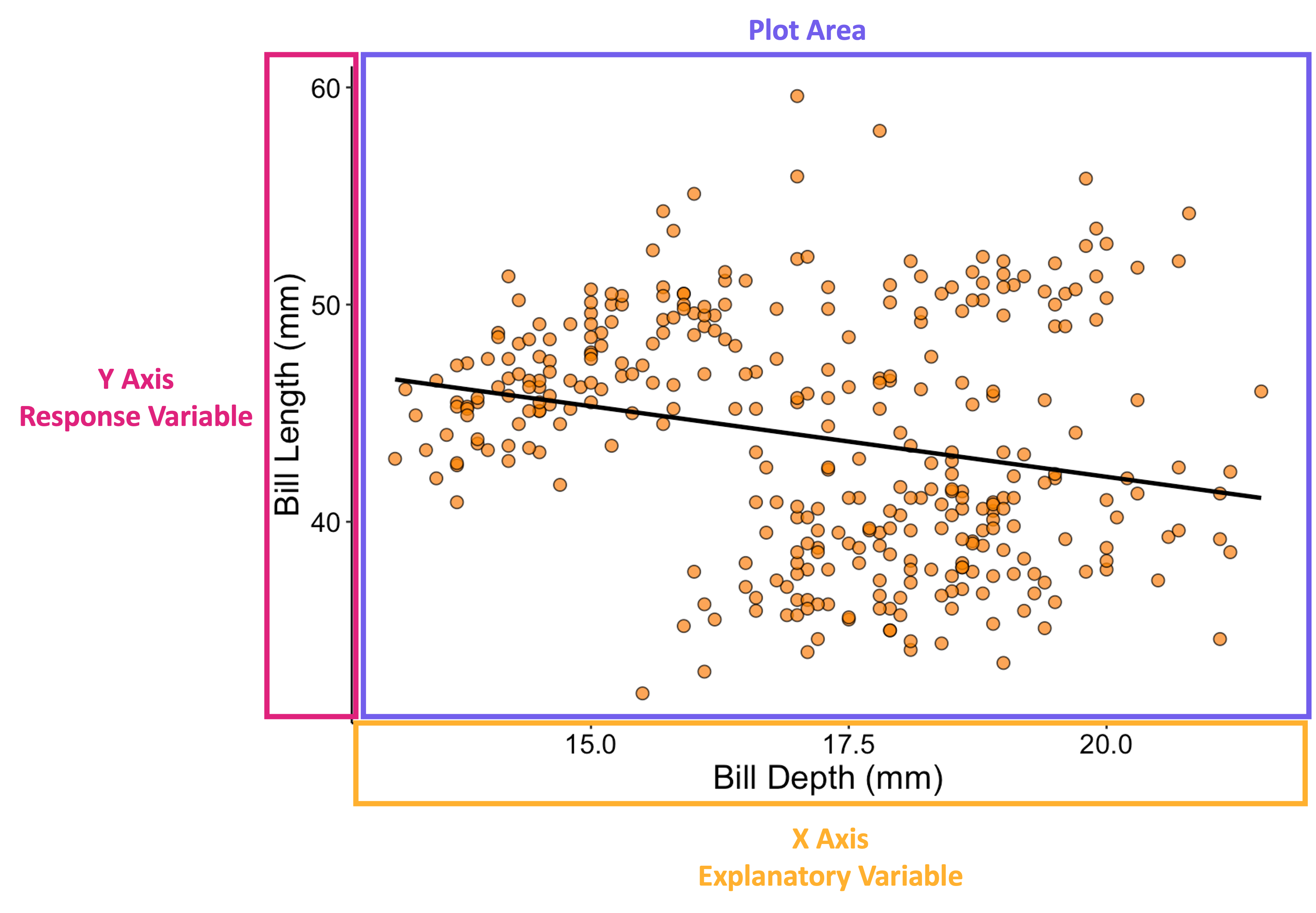
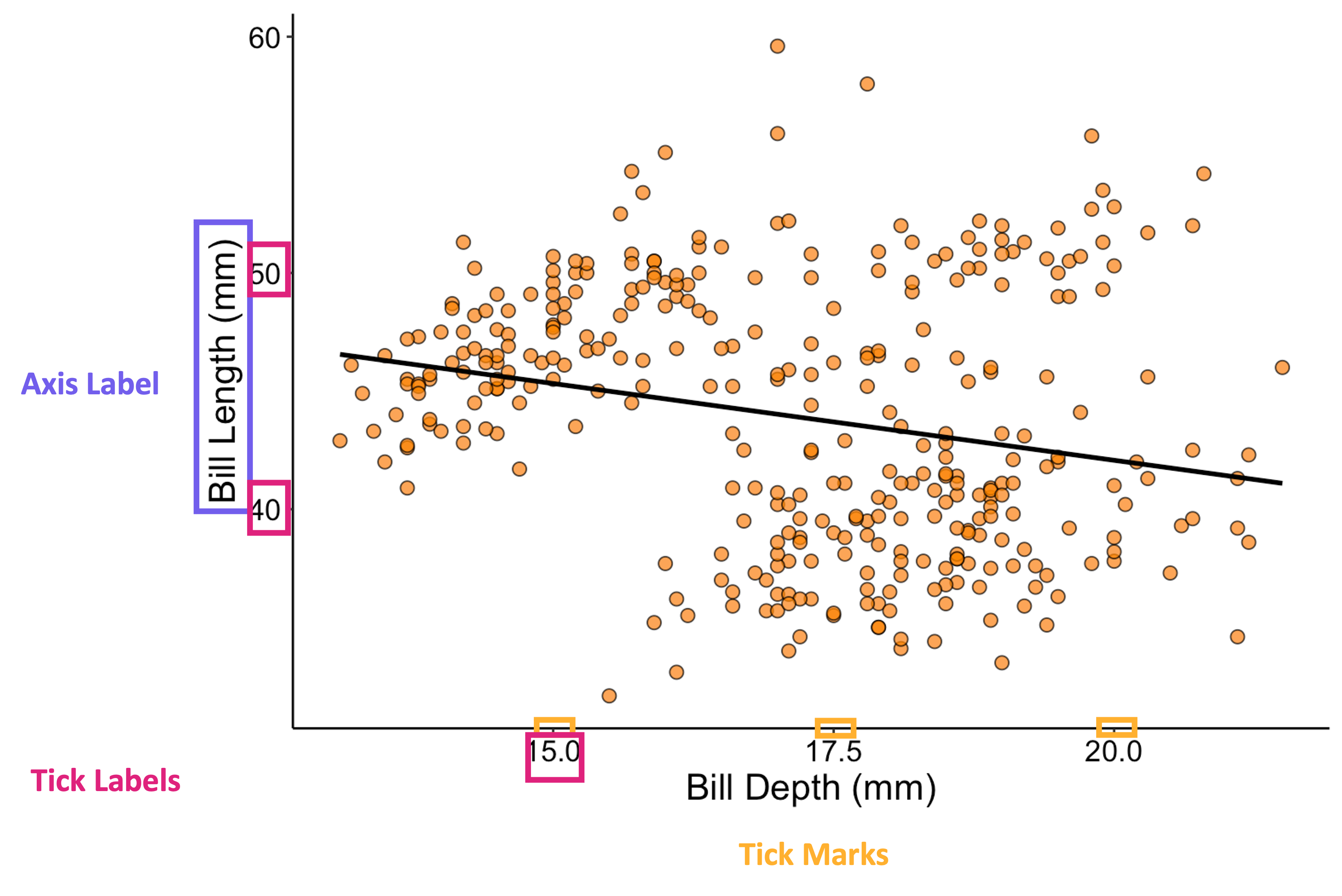
Anatomy of a Graph - P3
![Same scatterplot as in prior image but with a box around the axis labels, another around the axis tick labels, and a final category of box around the tick marks themselves]()
Choosing the Right Graph
- There are a lot of different types of graphs you can make
- As you practice, your intuition will improve
- For now, we’ll use a simplified ‘roadmap’
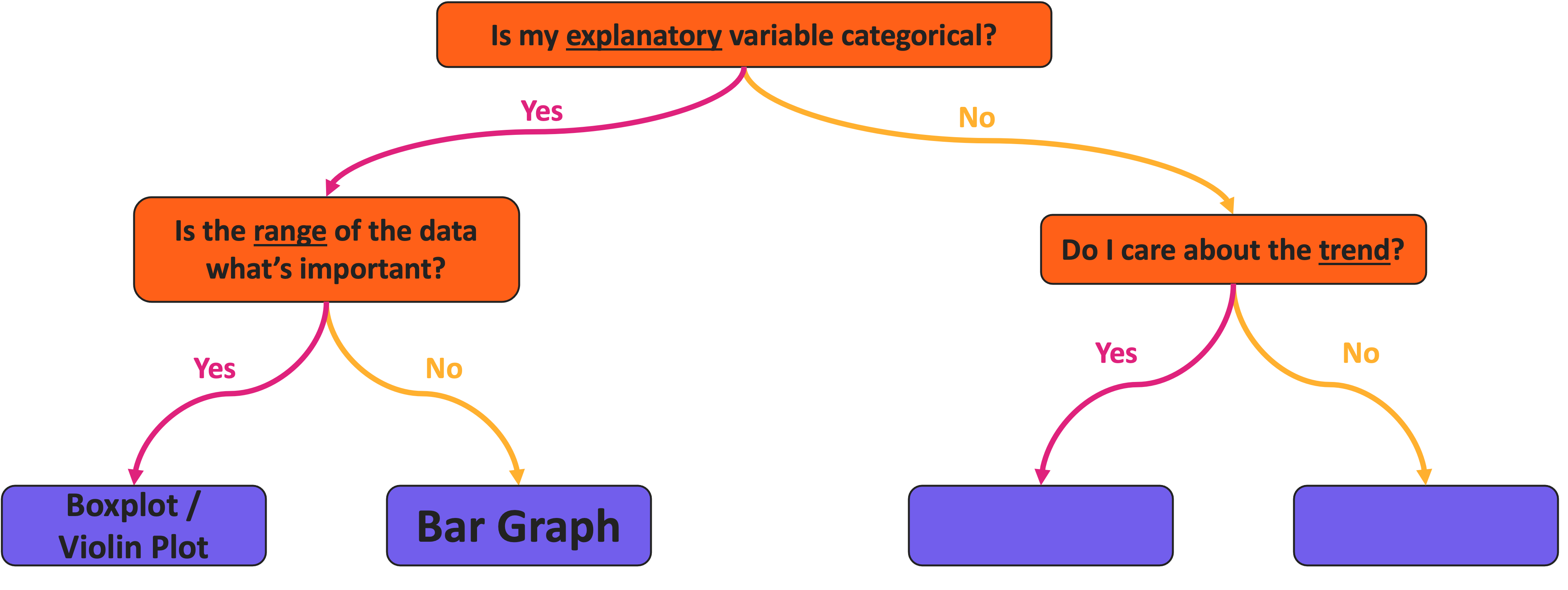
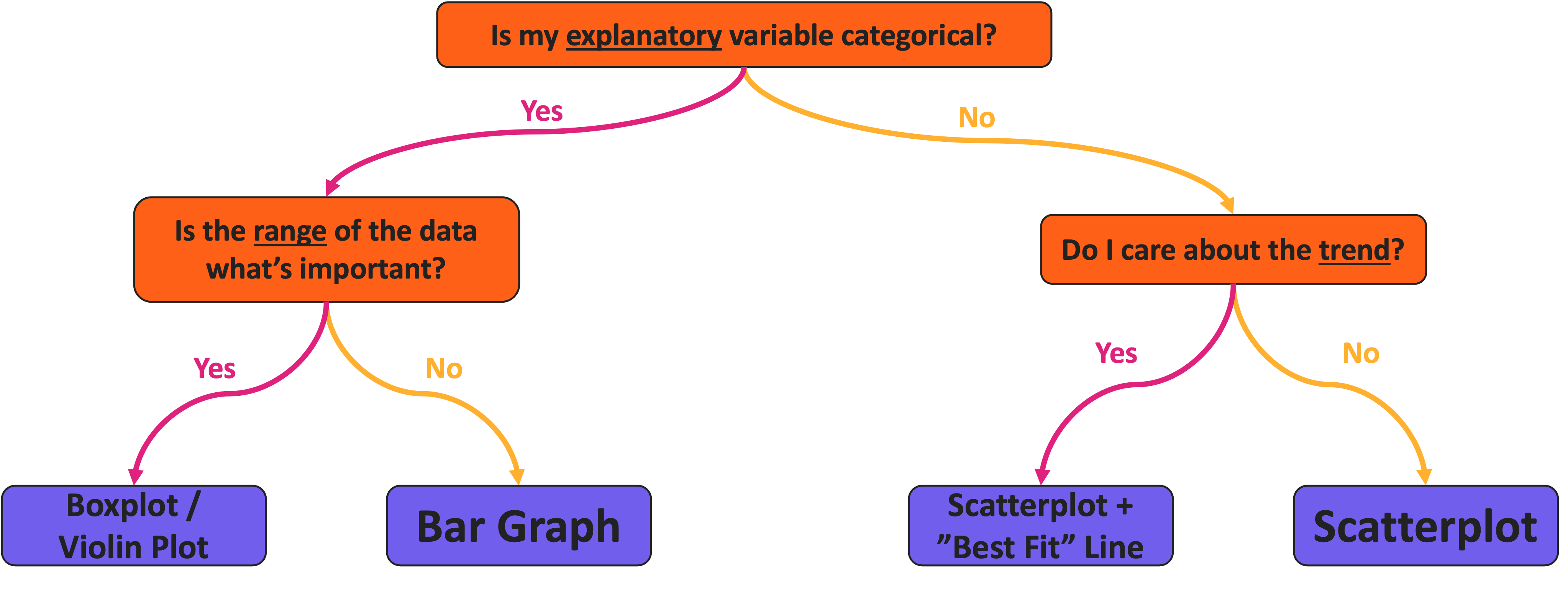
Graph Choice Roadmap
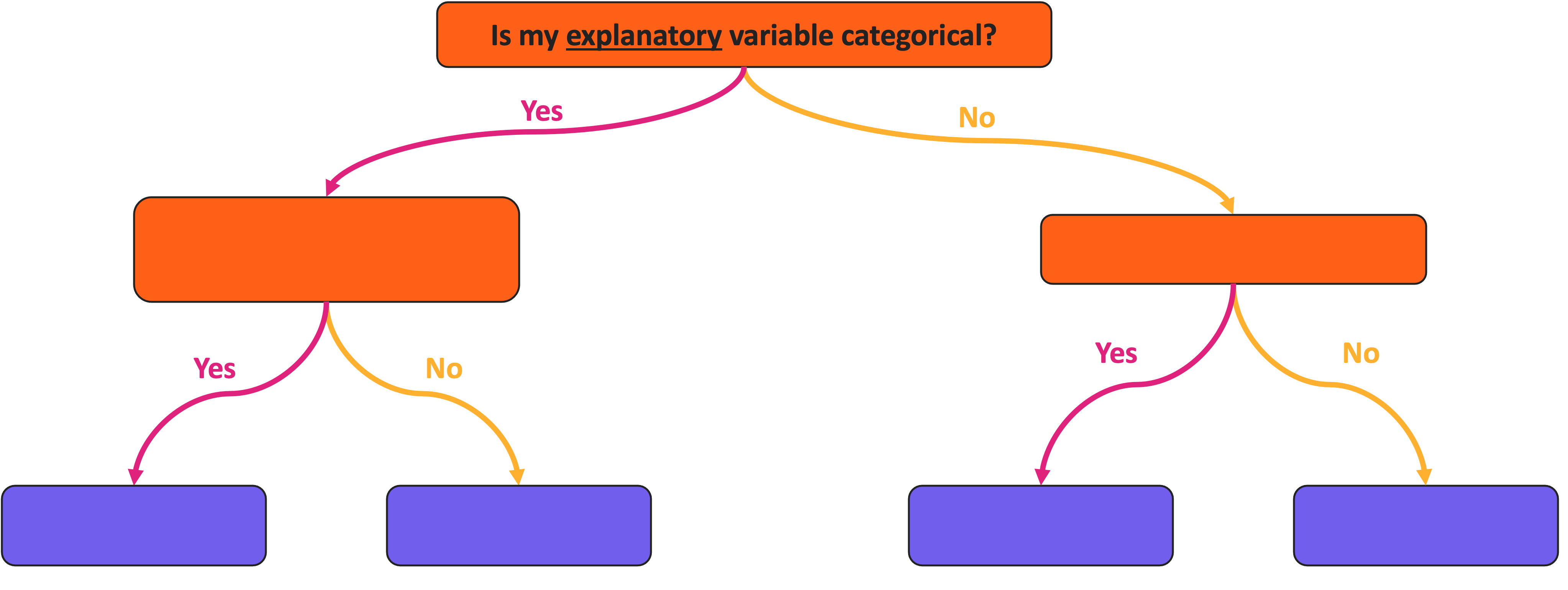
![Visualization roadmap with a series of yes/no branching lines between colored boxes. The top box says 'is my explanatory variable categorical?']()
Graph Choice Roadmap
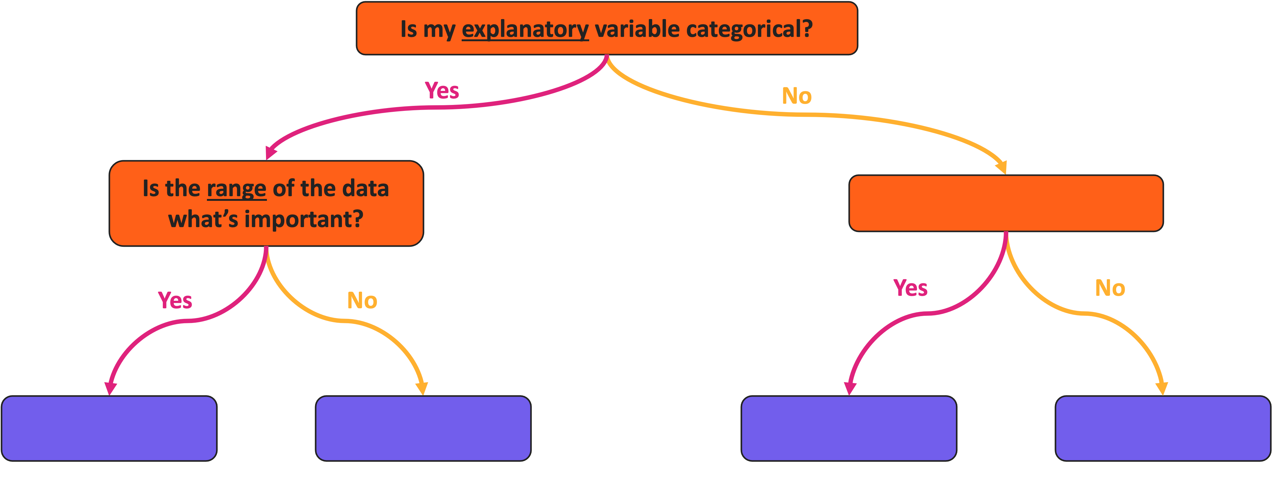
![Visualization roadmap with a series of yes/no branching lines between colored boxes. The top box says 'is my explanatory variable categorical?'. If 'yes' another box asks 'is the range of the data what's important?']()
Graph Choice Roadmap
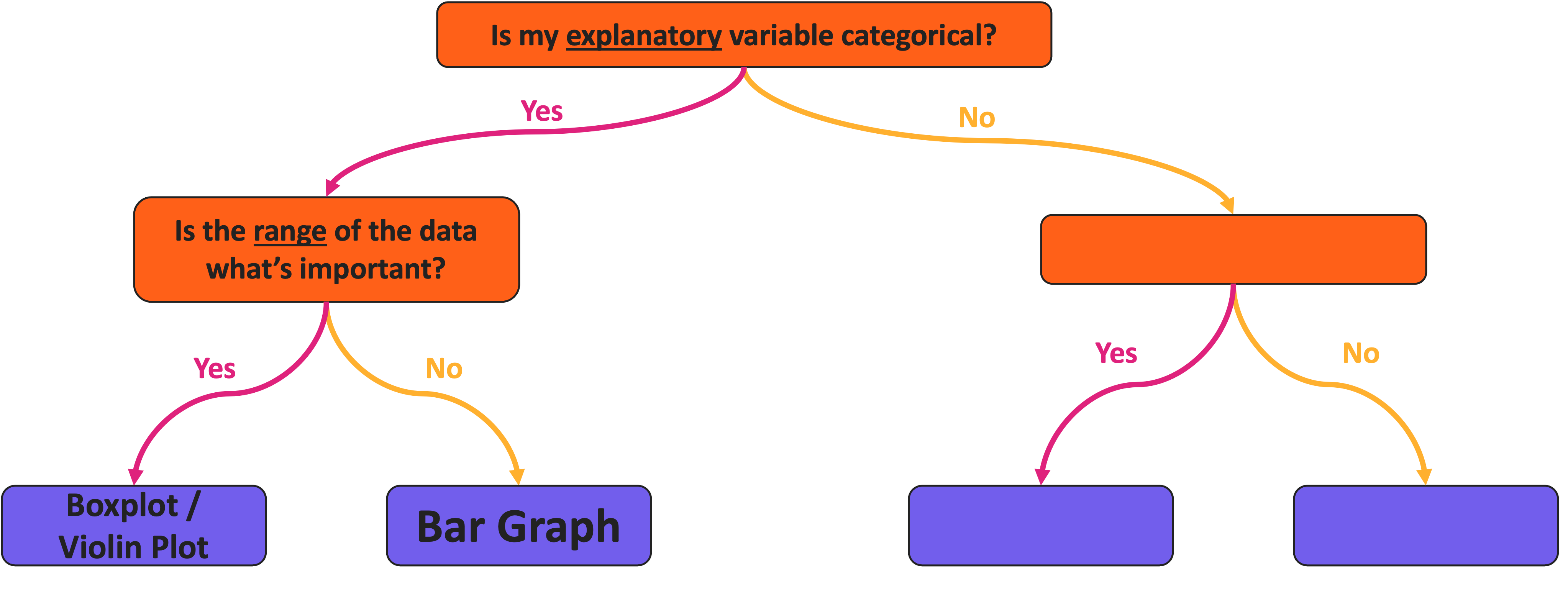
![Visualization roadmap with a series of yes/no branching lines between colored boxes. The top box says 'is my explanatory variable categorical?'. If 'yes' another box asks 'is the range of the data what's important?'. If 'yes', then boxplot/violin plot, if 'no' then bar graph.]()
Graph Choice Roadmap
![Visualization roadmap with a series of yes/no branching lines between colored boxes. The top box says 'is my explanatory variable categorical?'. If 'yes' another box asks 'is the range of the data what's important?'. If 'yes', then boxplot/violin plot, if 'no' then bar graph. If the explanatory variable is not categorical then another box asks 'do I care about the trend?']()
Graph Choice Roadmap
![Visualization roadmap with a series of yes/no branching lines between colored boxes. The top box says 'is my explanatory variable categorical?'. If 'yes' another box asks 'is the range of the data what's important?'. If 'yes', then boxplot/violin plot, if 'no' then bar graph. If the explanatory variable is not categorical then another box asks 'do I care about the trend?'. If 'yes' then scatterplot plus best fit line, if 'no' then just a scatterplot]()
Aside: Categorical Response Variable
- What if you have a categorical response
- If both your explanatory and response variables are categorical:
- You likely want a table instead of a graph
- Or something that is technically a scatterplot but has relatively few points
Temperature Check
How are you Feeling?
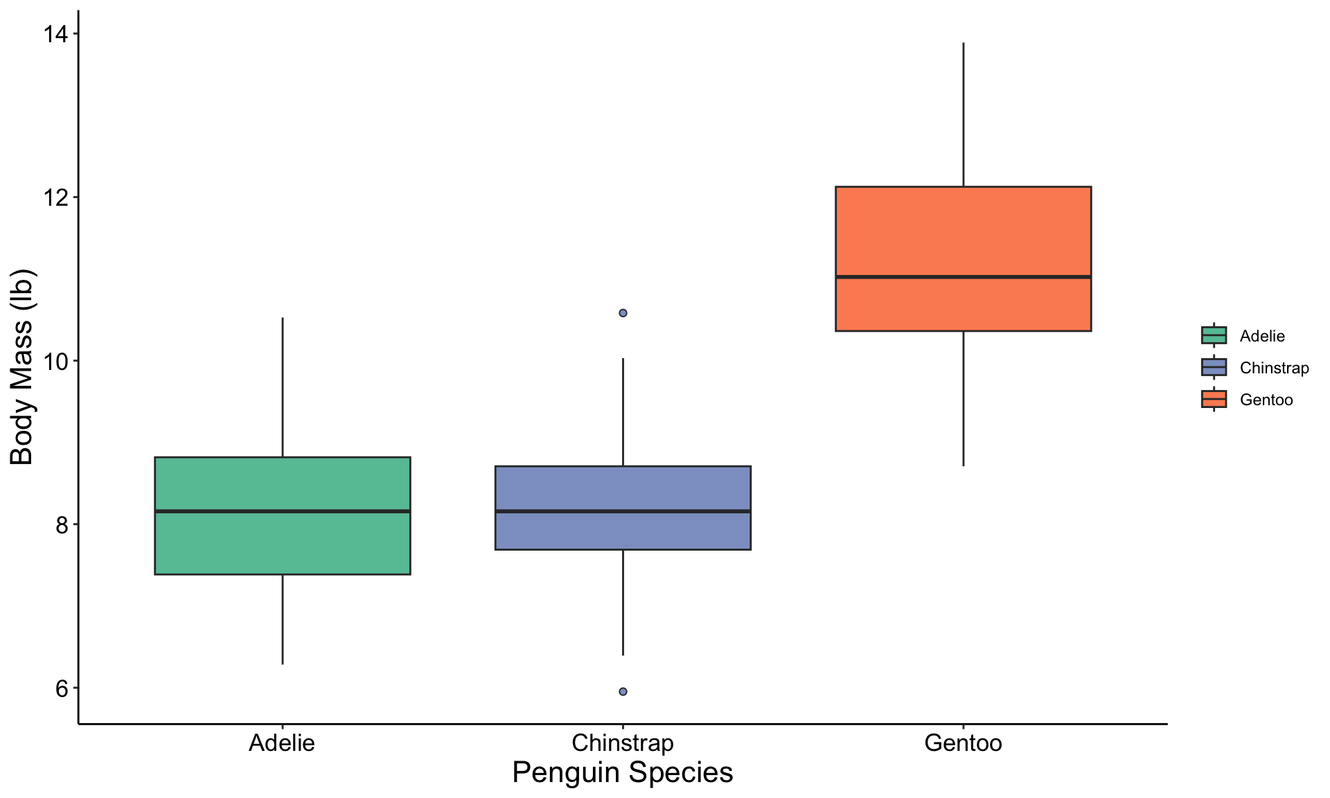
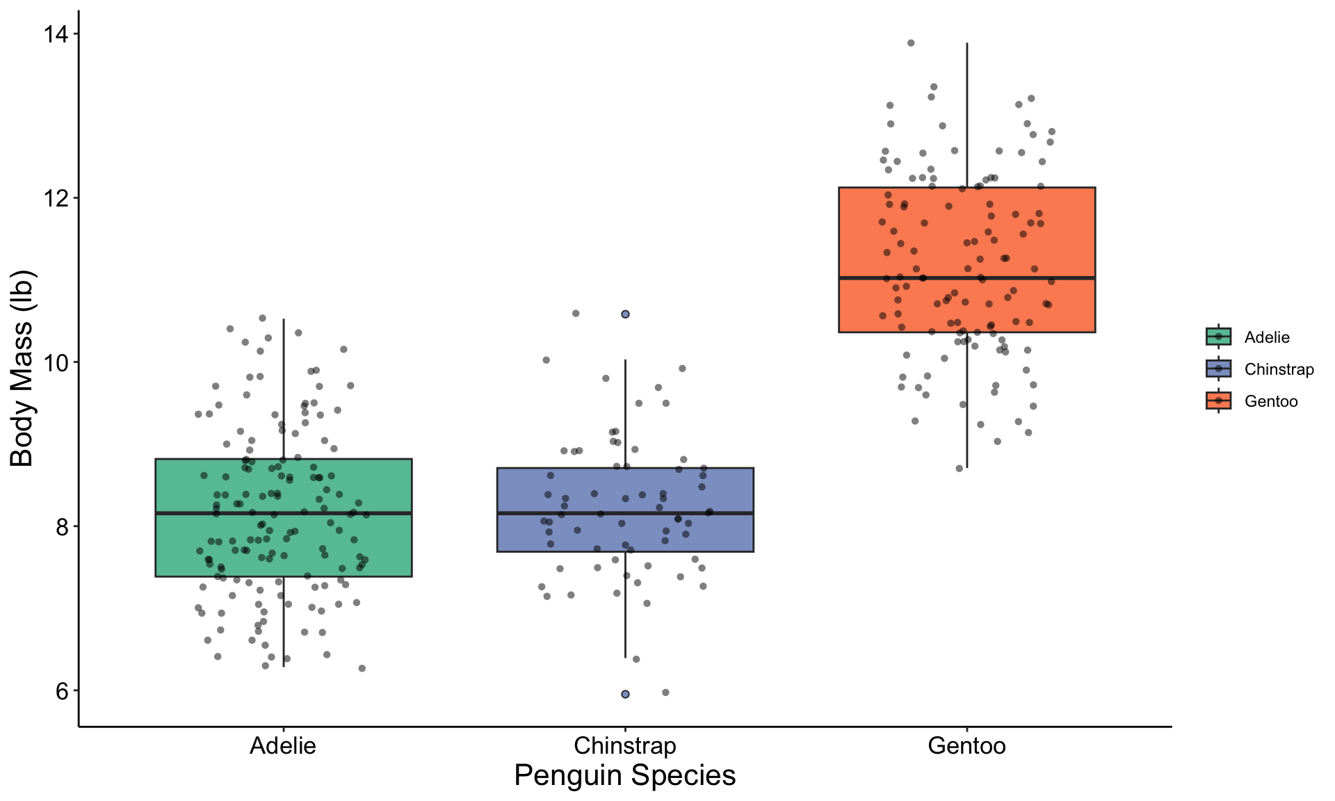
Graph Example: Boxplot
![hex logo for ggplot2 R package]()
![hex logo for palmerpenguins R package]()
Graph Explanation: Boxplot
![hex logo for ggplot2 R package]()
![hex logo for palmerpenguins R package]()
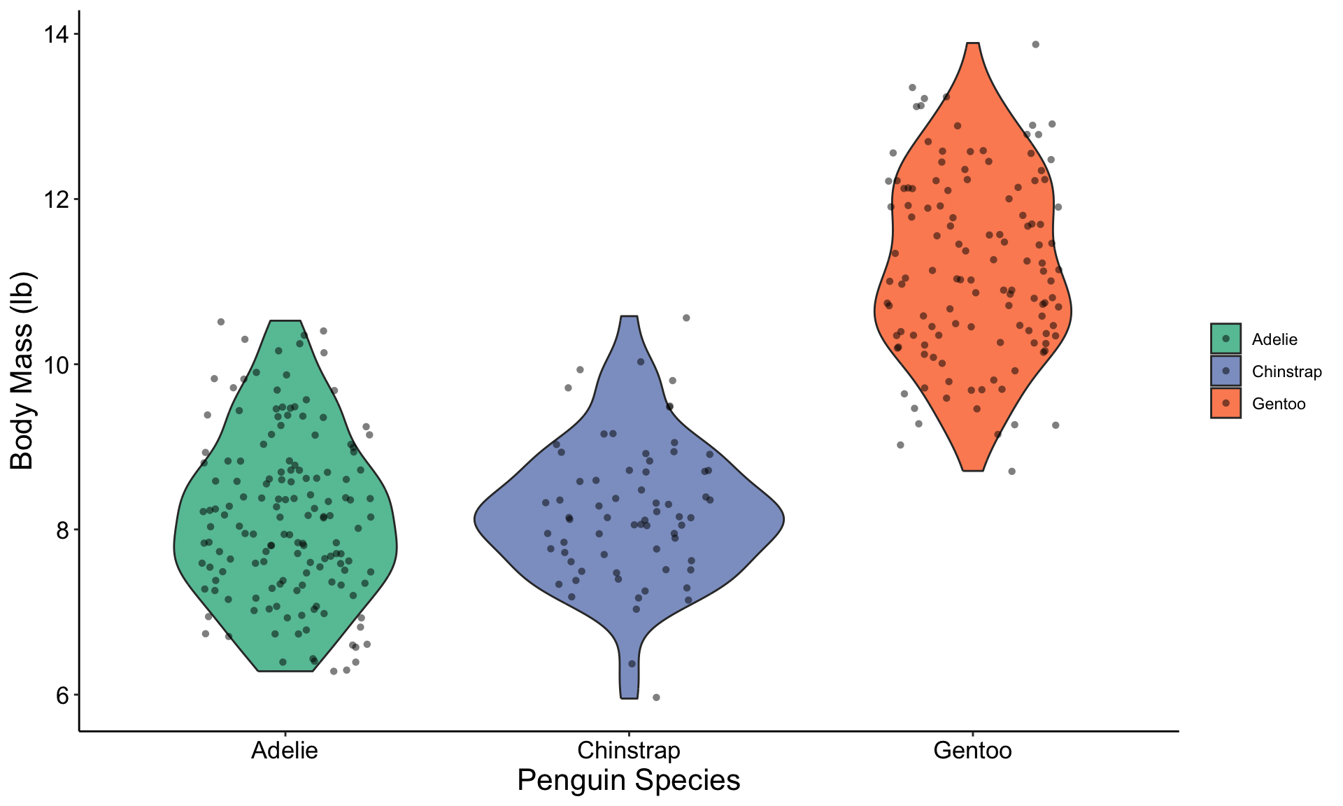
Boxplot Variant: Violin Plot
![hex logo for ggplot2 R package]()
![hex logo for palmerpenguins R package]()
Graph Example: Bar Graph
![hex logo for ggplot2 R package]()
![hex logo for palmerpenguins R package]()
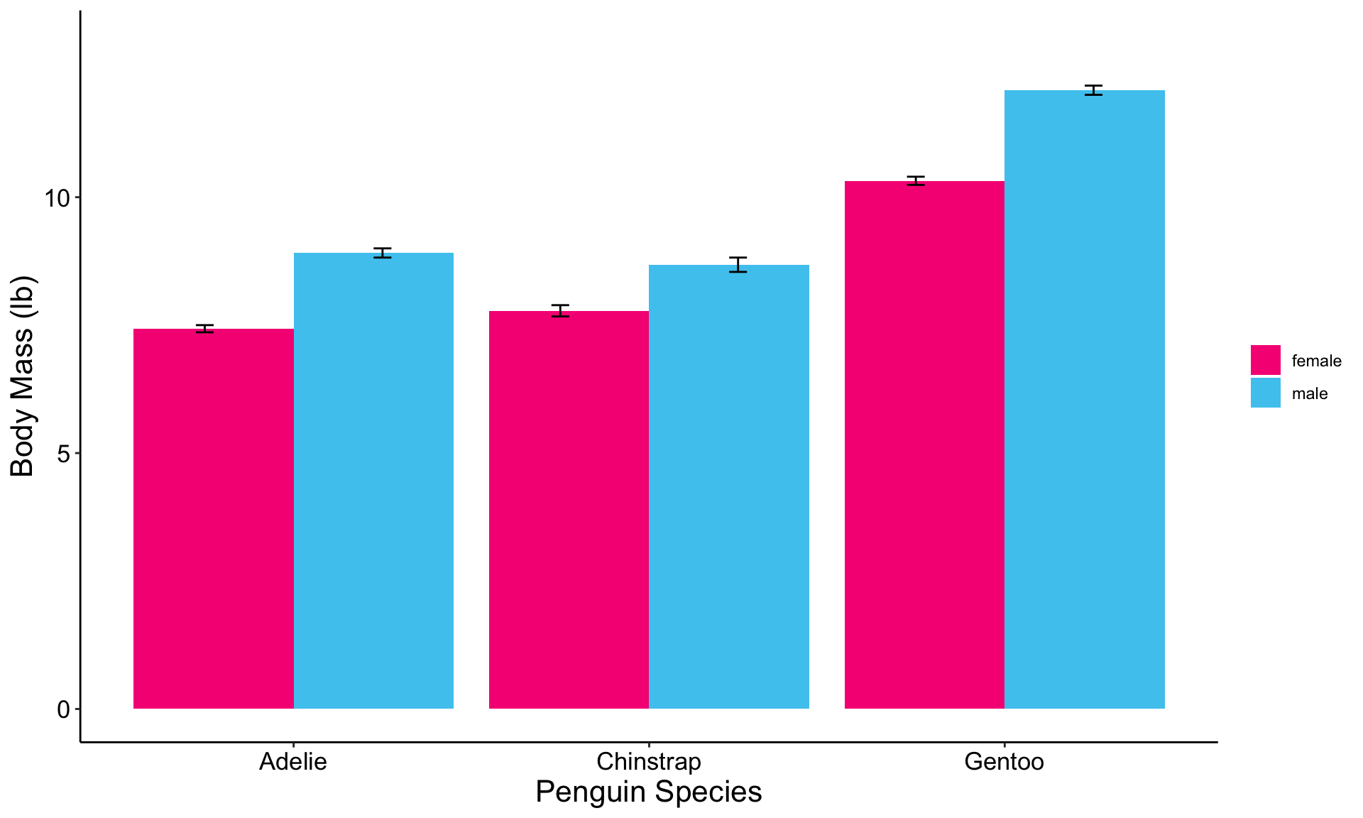
Bar Graph Expansion: With Error Bars
![hex logo for ggplot2 R package]()
![hex logo for palmerpenguins R package]()
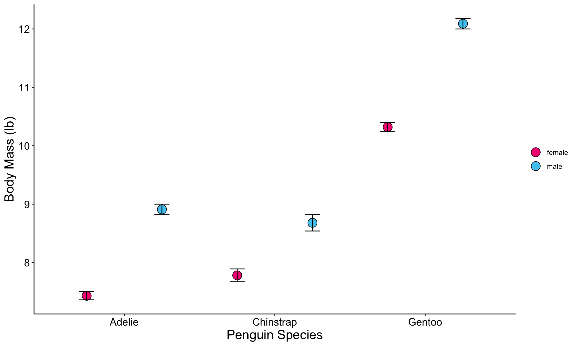
Bar Graph Variant: With Points!
![hex logo for ggplot2 R package]()
![hex logo for palmerpenguins R package]()
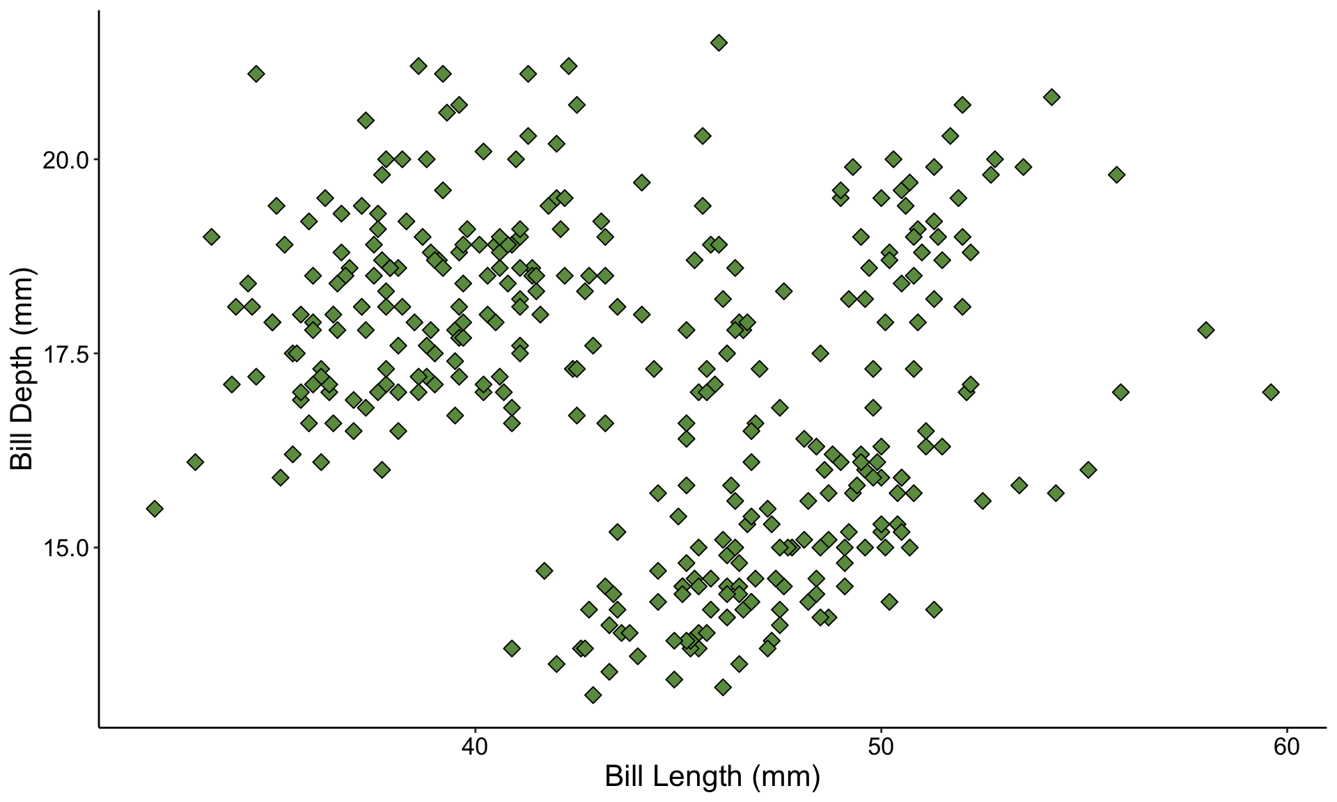
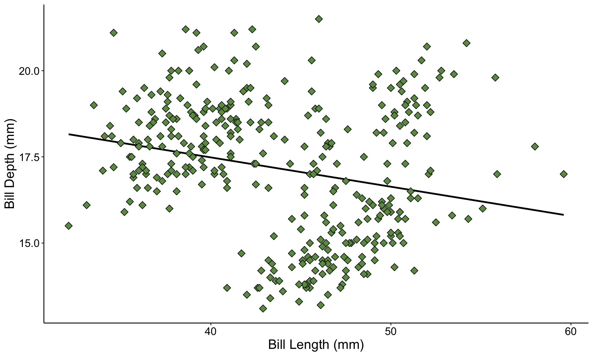
Graph Example: Scatterplot
![hex logo for ggplot2 R package]()
![hex logo for palmerpenguins R package]()
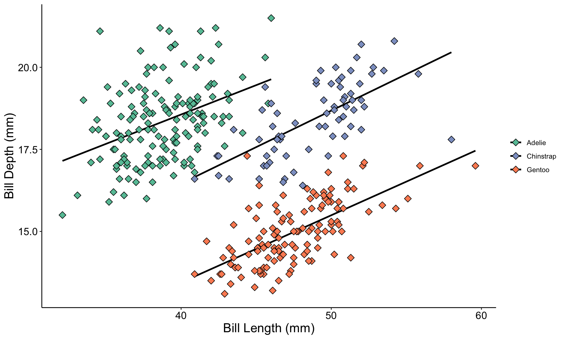
Scatterplot Expansion: With Trendline
![hex logo for ggplot2 R package]()
![hex logo for palmerpenguins R package]()
Graph Warning: Hidden Variables
![hex logo for ggplot2 R package]()
![hex logo for palmerpenguins R package]()
Temperature Check
How are you Feeling?
Pop-Quiz: Graph Choices!
- Let’s run through some examples!
- Raise your hand if you think you know the proper graph type to use in each of the following examples
Question 1
- You want to know the effect of fertilizer on sunflower size
- You grow 40 sunflowers, half in regular soil and the other half in soil with added fertilizer
- You’re interested mostly in the average response, not the variation among individuals
- What kind of graph should you make?
- A bar graph, but you might consider adding error bars
Question 2
- You are helping an entomologist with her field research
- You go to a bunch of sites in the desert, capture scorpions, and measure their length (before releasing them unharmed)
- Later, the entomologist also gives you hourly temperature data from those same sites
- Her hypothesis is that bigger scorpions can be found at warmer temperatures
- What kind of graph should you make?
- Likely a scatterplot, with a trendline
Question 3
- Your client has recently upgraded their website to be more inviting and accessible to users
- They provide you with web traffic data including how long each user spent on their website for a week before and a week after they implemented their changes
- The client is interested especially in how their changes affected the variation in how long users remain at their website
- What kind of graph should you make?
- A boxplot or violin plot will be best!
More About Me
- Professional Portfolio: github.com/njlyon0
- Personal Website: njlyon0.github.io