Intro to Data Science

Lecture 6 – Visualization I

A Guide to Your Process

Scheduling

Learning Objectives

Practice

Supporting Information

Class Discussion

Today’s Plan

  • Function Tutorial Debrief
  • Data Visualization with ggplot2
    • Core ggplot
    • Adding geometries
    • Multiple geometries
    • Setting color
    • Customizing colors

Today’s Learning Objectives

After today’s session you will be able to:

  • Discuss presentations and articulate plans for revision
  • Create ggplot2 graphs
  • Modify ggplot2 graph aesthetics and customize labels / colors

Function Tutorial Debrief

  • How did y’all feel that went?


  • What do you plan on doing differently for the 2nd presentation?


  • What questions do you have about the revision process / 2nd draft?

Data Visualization

  • Fundamental part of scientific process


  • Important for:
    • Figures in papers / presentations
    • “Eyeball test” of statistical results
    • Identifying errors in data (e.g., unreasonably high/low points, typos, etc.)


  • Note on word choice
    • Visualization == figures == graphs == plots
    • “Figures” are implicitly publication-quality but fundamentally still graphs

Data Viz in R

Two main options for data viz in R:

Base R

  • From base R
  • Simple but functional
  • Base R function syntax

ggplot2

  • From ggplot2 package
  • Modular functions allow range of complexity
  • Syntax similar to tidyverse but not identical
  • Name derived from Grammar of Graphics

Data Viz in R

Two main options for data viz in R:

Base R

ggplot2

Plot Structure: ggplot2

  • Requires three components (+ optional fourth)


  1. Data object to plot
  1. Mapping aesthetics
    • E.g., which column is on each axis, etc.
    • I.e., which variable is “mapped to” a given plot component
  1. One or more geometries
    • Determines what type of plot you have
  1. Theme elements
    • Controls plot-level formatting

Core ggplot Creation

  • Core plot is just data object + aesthetics
    • Tells ggplot to create a plot with specified axes


  • Data object is inherited by every other layer of the plot
    • So only needs to be specified once!


  • What aesthetics can you specify?
    • X/Y axes
    • Color(s) of geometries

Core Graph Syntax

  • Fundamental graph syntax requires two functions:
    1. ggplot
    2. aes


  • Check out this example:
# Make a simple `ggplot2` plot
ggplot(data = my_df, mapping = aes(x = x_var, y = y_var))

Core ggplot2

hex logo for ggplot2 R package

  • Get prepared for this practice
    • Create a script for this week
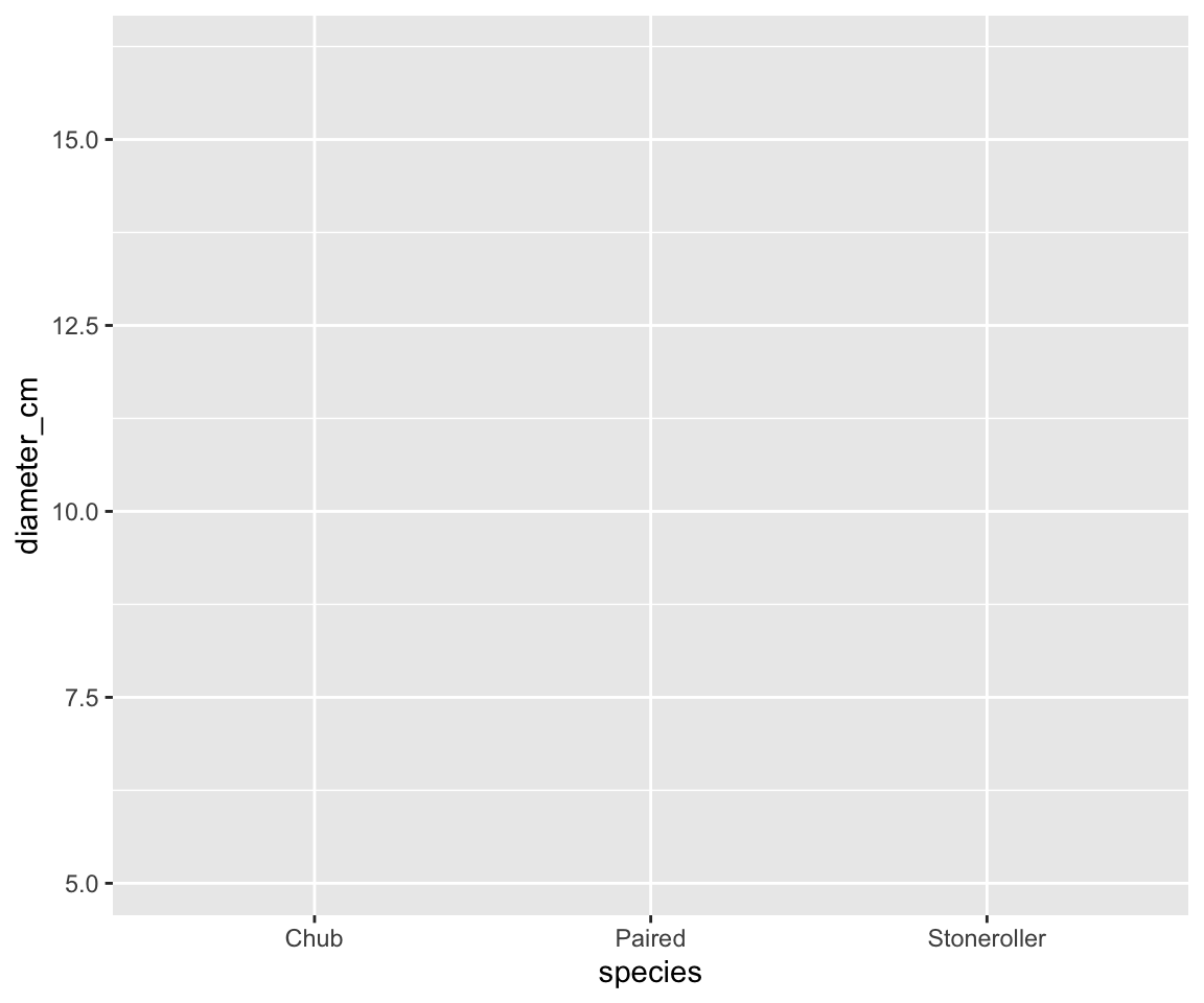
    • Download and read in the “minnow.csv” data


  • Using 
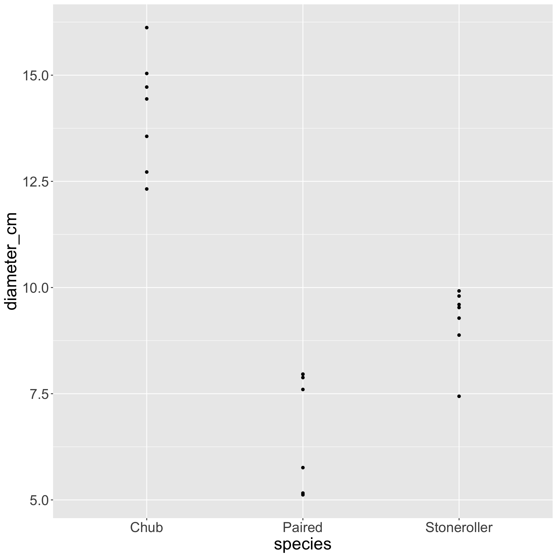
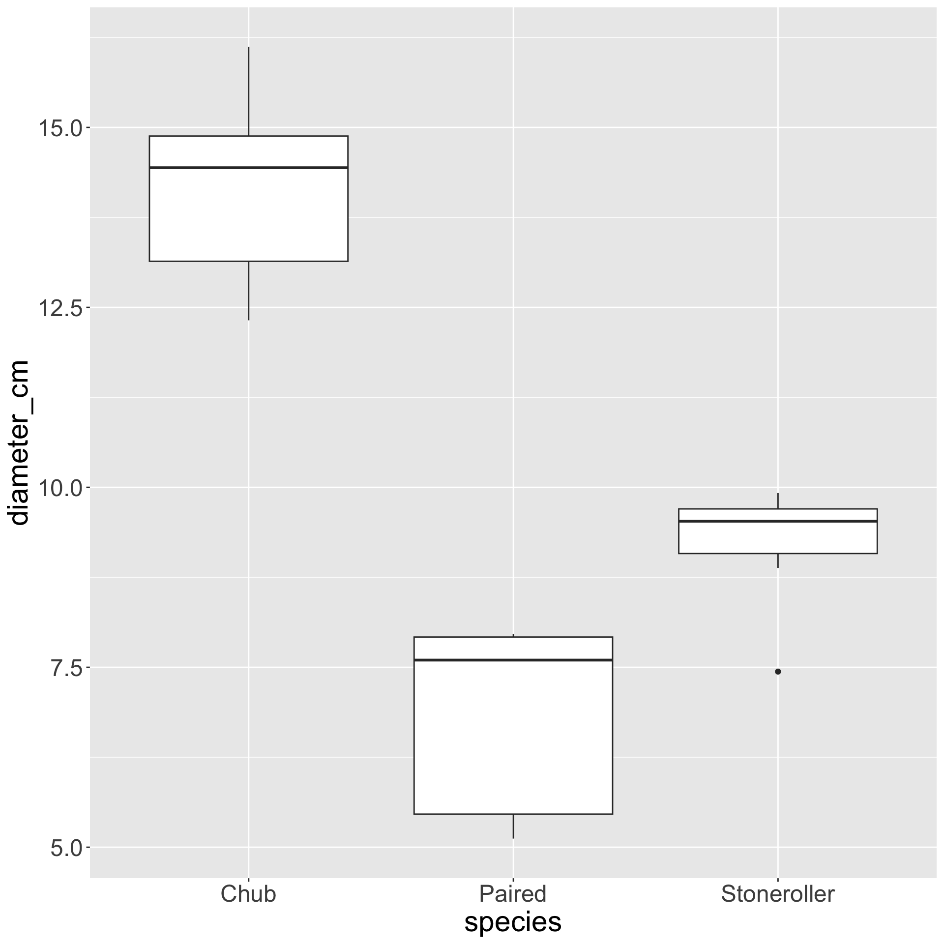
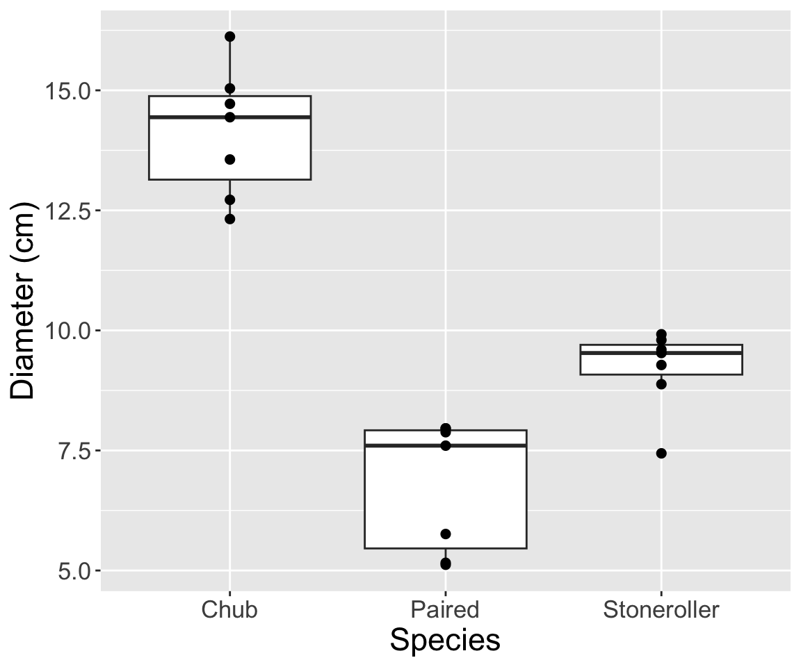
ggplot2, make a graph with the minnow data where:
    • Fish species is on the X axis
    • Diameter of fish nest is on the Y axis


  • What does the resulting graph look like?

Core ggplot2

hex logo for ggplot2 R package


Plot Type & Geometries

  • Why does the plot not have anything on it?
    • Because ggplot2 needs you to specify your geometry!


  • Geometries are functions you add to a plot to make the desired plot type
    • All start with geom_...
    • E.g., geom_bar, geom_point, etc.


  • Geometry determines the type of plot
    • E.g., bar plot, scatterplot, etc.

Adding Elements

  • Use + to add geometries to a plot


  • Example syntax:
# Make a simple `ggplot2` plot
ggplot(data = my_df, mapping = aes(x = x_var, y = y_var)) +
    # Make it a scatterplot
    geom_point()


  • This syntax is unique to ggplot2
    • Refers to stacked layers of plot information

Geometries

hex logo for ggplot2 R package

  • Let’s practice adding geometries!
    • Copy the code you wrote for the previous graph
    • Add a + to the end of the line
    • In the next line add geom_point()


  • What does that give you?


  • Copy that code and change geom_point() to geom_boxplot()
    • What do you have now?

Geometries

hex logo for ggplot2 R package

Temperature Check

How are you Feeling?

Comic-style graph depicting someone's emotional state as they debug code (from initial struggle and defeat to eventual triumph)

Geometries Cont.

  • Geometries “know” what data to use because of your core plot
    • I.e., in your top-level ggplot and aes functions


  • Geometries do support arguments but minimal graphs don’t use them


  • Mappings/aesthetics inherited from top to bottom

Multiple Geometries

  • You can add multiple geometries to the same plot!
    • But order matters!


  • Geometries added later are “in front” of earlier geometries


  • Similar to how first geometry is “in front” of core ggplot

Multiple Geometries

hex logo for ggplot2 R package

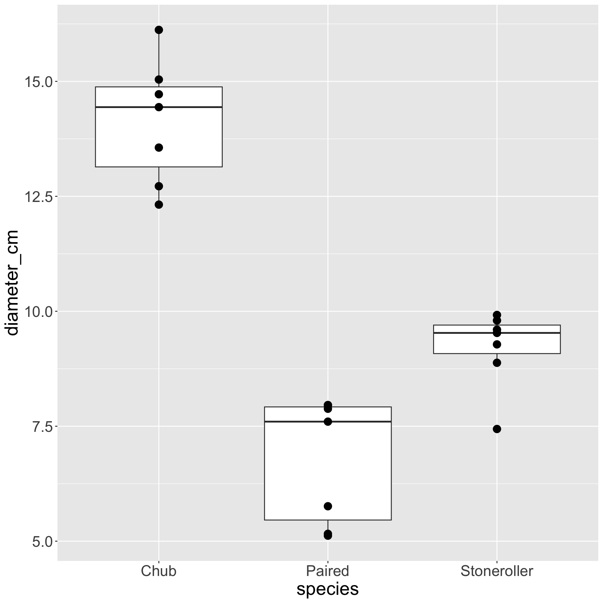
  • Make a graph with both geom_boxplot and geom_point
    • Add a + after whichever you put first, then put the other


  • What happens if geom_boxplot is first?


  • Versus if geom_point is first?

Multiple Geometries

hex logo for ggplot2 R package

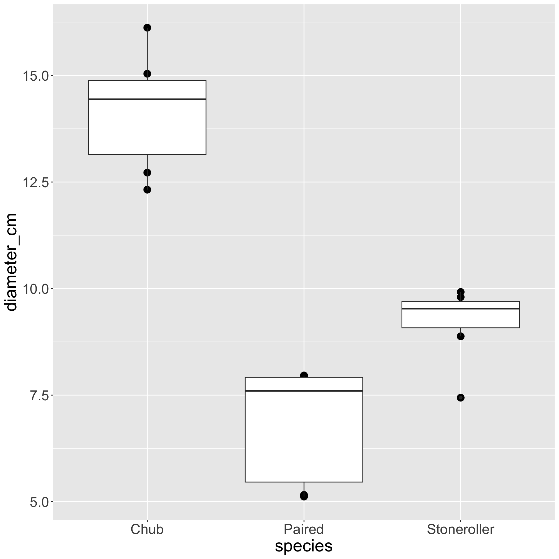
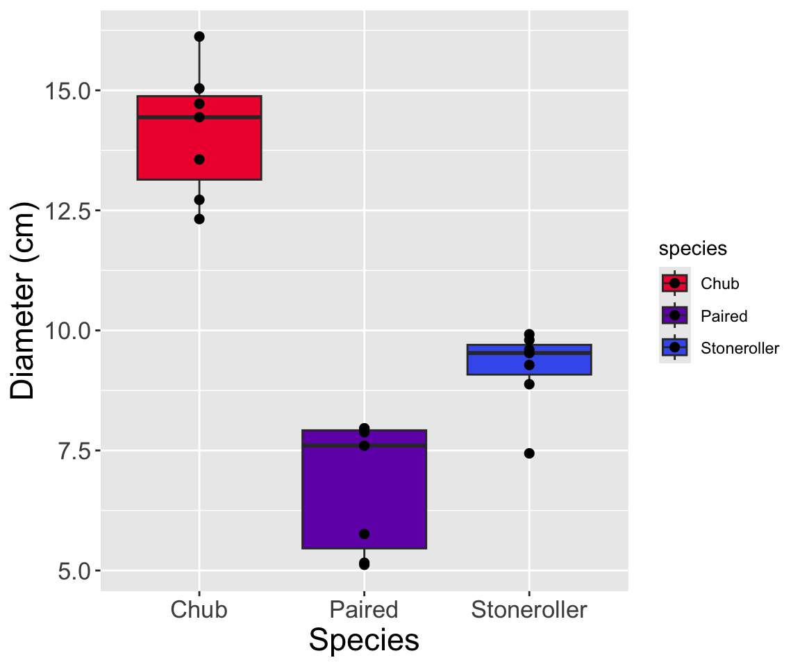
See how points are “behind” boxplots on the left?
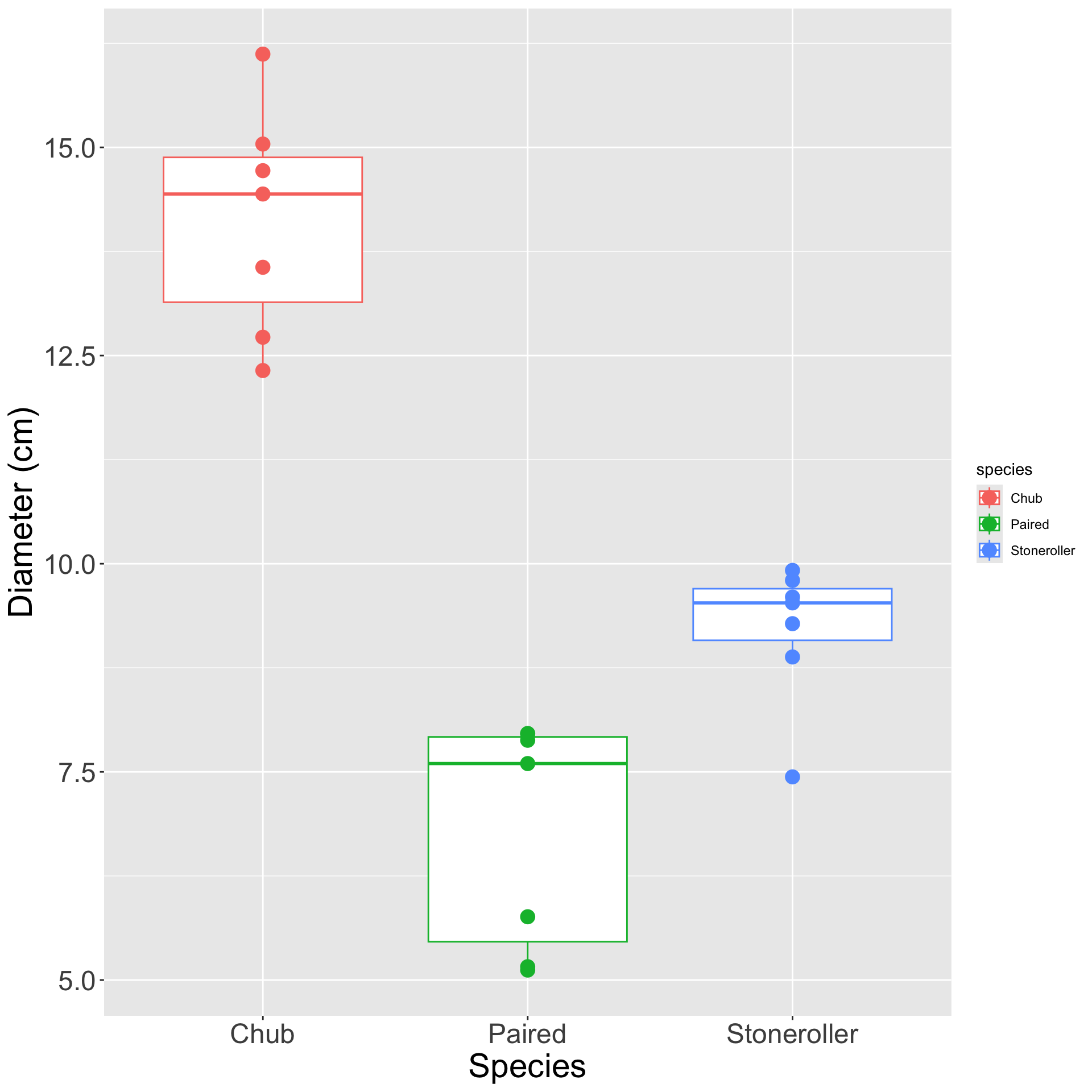
Axis Titles

  • Axis titles default to column name passed to aes


  • Good column names are usually not good plot axis labels!


  • Column names should have no spaces / may or may not be capitalized
    • Plot axes should have spaces and be at least somewhat capitalized
    • Units may be in parentheses

Manual Axis Labels

  • Can set labels manually to be prettier with labs function!


  • labs has arguments x and y that expect characters to put as titles


  • Example syntax:
# Make a simple `ggplot2` plot
ggplot(data = my_df, mapping = aes(x = x_var, y = y_var)) +
    # Make it a scatterplot
    geom_point() +
    # Add custom axis labels
    labs(x = "Custom X Label", y = "Custom Y Label")

Axis Labels

hex logo for ggplot2 R package

  • Copy your code for the plot with:
    • Both a boxplot and points
    • Points in front of boxplots


  • Use labs to do do the following:
    • Capitalize “species” and “diameter”
    • Put “cm” in parentheses on the y-axis


  • What does that graph look like?

Axis Labels

hex logo for ggplot2 R package


Manual Label Cautionary Note

  • If you mis-apply the labels your plot will still work but will be wrong

Two scatterplots side by side with the same configuration of points but flipped axis labels.

  • Same plot but flipped labels and no way to know which is correct!
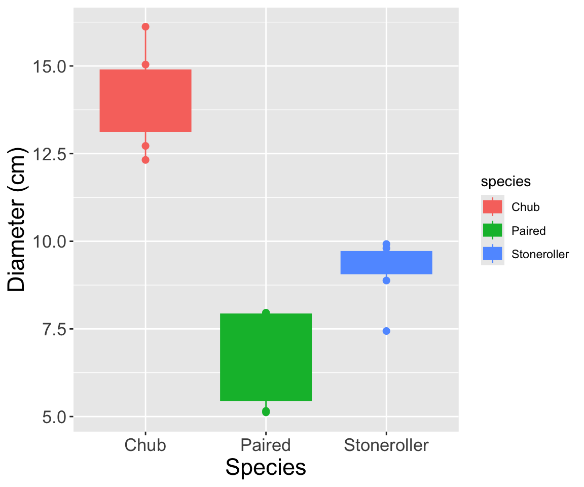
Coloring Geometries

  • You can color geometries by other columns in the data!
    • You just need to pass them to the color or fill aesthetics


  • Example syntax:
# Make a plot where the color and y-axis are mapped to the same variable
ggplot(data = my_df, mapping = aes(x = x_var, y = y_var, color = y_var)) +
    # Make it a scatterplot
    geom_point() +
    # Add custom axis labels
    labs(x = "Custom X Label", y = "Custom Y Label")


  • Color != Fill
    • Color = borders / solid points
    • Fill = interior of shapes / points

Geometry Color

hex logo for ggplot2 R package

  • Take the plot you created during the previous practice:
    • What happens if you map color to species in the aes call at the top?


  • Change color to fill. Now what does the plot look like?

Geometry Color

hex logo for ggplot2 R package

color = species

fill = species

Geometry Color

hex logo for ggplot2 R package

  • What happens if you map species to both color and fill?


  • Try it and find out!

Geometry Color

hex logo for ggplot2 R package

Customizing Colors

Meme where Pedro Pascal is saying 'life is good but it could be better' in two panels. Top panel is a default color graph then bottom panel is the same graph with custom colors

Finding Fun Colors


  • Color Brewer 2.0 (colorbrewer2.org)
    • Fewer options but checkbox for colorblind safe palettes only


  • Colors identified as hexadecimal codes
    • Hexadecimal structure: #RRGGBB

Hexadecimal Aside

  • Hexadecimal = 16 digits
    • 0-9 + a-f


  • Red/Green/Blue hues can be between 0 and 255
    • “Colors” are combinations of 0-255 of R/G/B


  • Color with regular numbers = #RRRGGGBBB
    • If using hexadecimals: three fewer numbers to store in a computer
    • Each color x 103-106s of pixels would compound “extra” digits’ memory demands

Manually Setting Colors

  • Use scale_fill_manual() or scale_color_manual()
    • Each has one argument: values


  • Needs a named vector of hexadecimal codes
c("name 1" = "entry 1", "name 2" = "entry 2", "name 3" = "entry 3")
   name 1    name 2    name 3 
"entry 1" "entry 2" "entry 3" 


  • Example syntax:
# Make a plot where the color and y-axis are mapped to the same variable
ggplot(data = my_df, mapping = aes(x = x_var, y = y_var, color = y_var)) +
    # Make it a scatterplot
    geom_point() +
    # Add custom axis labels
    labs(x = "Custom X Label", y = "Custom Y Label") +
    # Customize colors
    scale_color_manual(values = c("name 1" = "#00FF00", "name 2" = "#FF0000", "name 3" = "#0000FF"))

Set Colors

hex logo for ggplot2 R package

  • To the graph you made in the previous practice:
    • Make species fill with custom colors


  • What does that final plot look like?

Set Colors

hex logo for ggplot2 R package

Temperature Check

How are you Feeling?

Comic-style graph depicting someone's emotional state as they debug code (from initial struggle and defeat to eventual triumph)

Upcoming Due Dates

Due before lab

(By midnight)

  • Muddiest Point #6

Due before lecture

(By midnight)

  • Nothing! Face Smile